Wondering what to do with that awkward seventies style ceiling in your home or upcoming project? Join me as I tackle this design challenge and share my top shed roof design tips that will help bring balance back to your space.
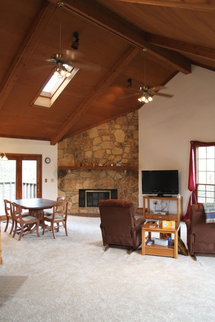
I recently remodeled a duplex that had one of those soaring seventies triangle ceilings that is double or triple height on one side and slopes down to windows on the other. You’ve all seen them. I’m personally not a fan… I mean, what are you supposed to do with twelve feet of wall above your head?


Shed roofs can be one of those undeniable elephants in the room that makes the whole space feel, well, just off. I’ve tried to just ignore them (that doesn’t work) or creatively fill the space with rugs or large art or other interesting things (that also doesn’t work), so here are a few of my shed roof design ideas for dealing with this particular design challenge if it bugs you.
- Don’t ignore it. I always maintain that no matter how nice the finishes you select or how well you decorate or paint a space, if the proportions of the naked space are off to you, it will always feel off. Putting lipstick on a pig eventually wears off. Don’t convince yourself it doesn’t matter. Change it. I’ve learned this the hard way, so my advice is to spend a little extra money or time to have it feel right…this yields great dividends over time.
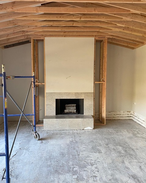
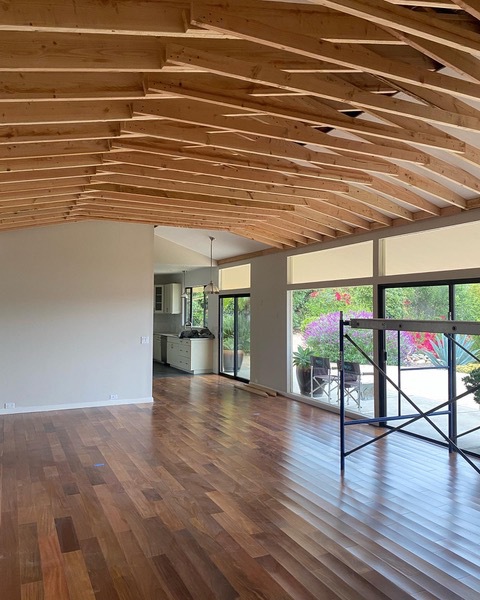
- Talk to your contractor about your ceiling options. Because shed roofs typically slope down into a wall of glass, the glass side is typically at a regular, and often even gracious, height. Framing is fast and pretty inexpensive, so talk to your contractor about changing the ceiling entirely. There are often many options, like dropping in a simple flat ceiling, or pitching it up into a flat tray, like in the pictures above. In fact, sometimes changing the ceiling gives you a place to hide ducting and add interesting new lighting.
- Change the scale of adjacent items. Often a shed roof design has no symmetry and items are out of scale in proportion to the single extra high ceiling. Are there bookshelves you can make more weighty? Is there a fireplace you can make more prominent? Can you add some visual weight with color on the smaller wall? Ask your contractor if there are any ways to add some heft to the lower wall to balance the height.

Need more interior design solutions? Check out my Style Tips & Guides for more inspiration, design challenges and tips!
